sTaTIon A
BY crIaD
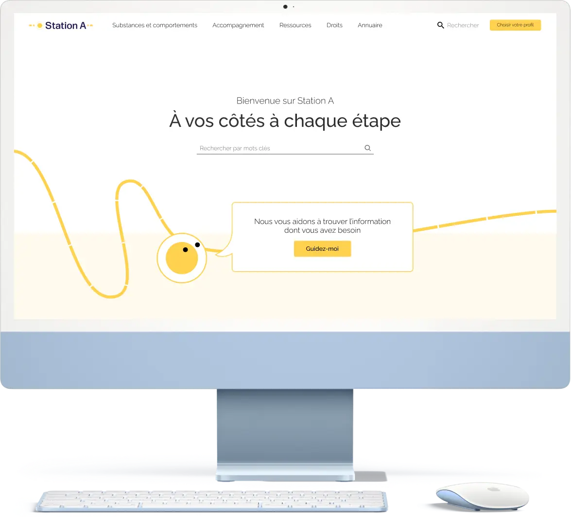
At creatives agency I transformed a decentralized ecosystem on addiction into a centralized hub catering to diverse user groups across six cantons. Implemented an innovative navigation system, blending robust organization, user profiles, dynamic content, and associative navigation. The result optimized information accessibility for a broad audience, from homeless individuals to medical professionals, fostering a more supportive and tailored user experience.
Role
- Main UX
- Main UI
- Branding
Tools
- Figma
- Css
- Javascript
Responsibilities
- Prototyping
- Usability testing
- Visual Design
More Responsibilities!
- Client presentation
- Custom design system
qUIck ovErvIEw
Context
In French-speaking Switzerland, vital information regarding addiction, dependency, associated risks, and care is is widely dispersed. Our client, CRIAD, sought to enhance access to this information by creating a centralized platform that guides users to the broader ecosystem.
Problem
The user base spanned six cantons, each with its distinct care system. The platform aimed to serve individuals facing addiction and their support networks.
This diverse user spectrum, from a homeless person to a medical professional or a parent, resulted in an abundance of information, much of which was only relevant to specific user groups.
Consumer Users
Support Users
Solution
Given the extensive content, the focus was on content organization and a multi-layer navigation structure. The tech lead and I devised a system incorporating:
- A robust base organisation
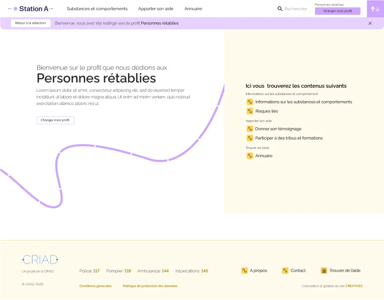
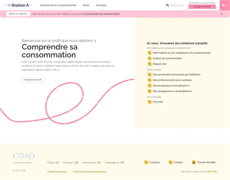
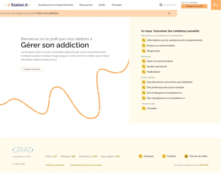
- User profiles
- Dynamic content & suggestions based on these profiles
- Associative navigation
- Search
This mix allowed people to to choose the navigation method most comfortable for them.
Identifying user profiles posed a challenge as directly asking users wasn't feasible. I resorted to indirect methods, but more on that later.

UX dEsIgn
Defining the users
Upon joining the project, the project manager, in collaboration with CRIAD, had initiated a survey distributed to organizations within the addiction space. These organizations, in turn, filled out the form and distributed it to those in need.
The substantial amount of collected data required analysis. I employed a dual interpretation method:
- Separation by Populations: Identifying common threads in needs within specific user populations.
- Separation by Needs: Identifying common threads in user populations based on their needs.
Comparing these distinct datasets allowed me to pinpoint the most prevalent needs.
Who came first, the user or the need?
The analysis unveiled a complex situation.
Individuals seeking help for their own consumption came from diverse backgrounds but shared a common need for assistance.
On the other hand, those supporting someone else had more homogeneous needs, shaped by their relationship with the addiction consumer.. For example, a doctor had different backgrounds and knowledge compared to a parent unsure about how to assist their child.
To address the diverse needs and content, we categorized the website. I created user profiles for content selection, but faced some complications in the process
- Addicts' Identification Issues: Addicts were hesitant to be identified and harbored trust issues with official websites.
- Background Limitations: Since addiction can affect anyone, relying on background information was not viable.
- Professional Time Constraints: Professionals had limited time and preferred streamlined processes.
- Limited Internet Access: Some addicts faced challenges due to limited internet access.
Prototyping a navigation structure
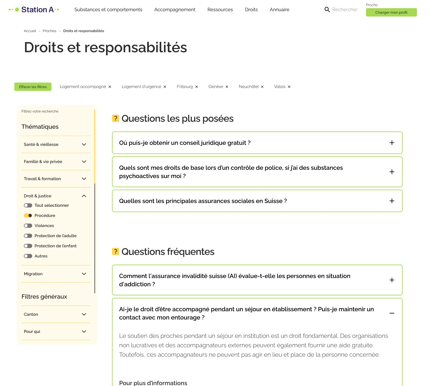
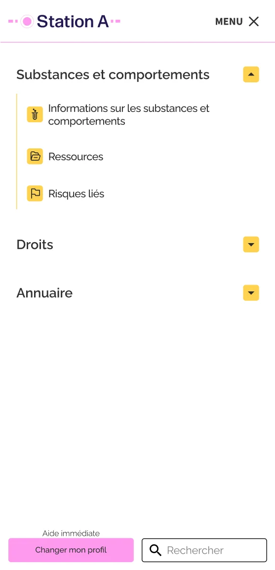
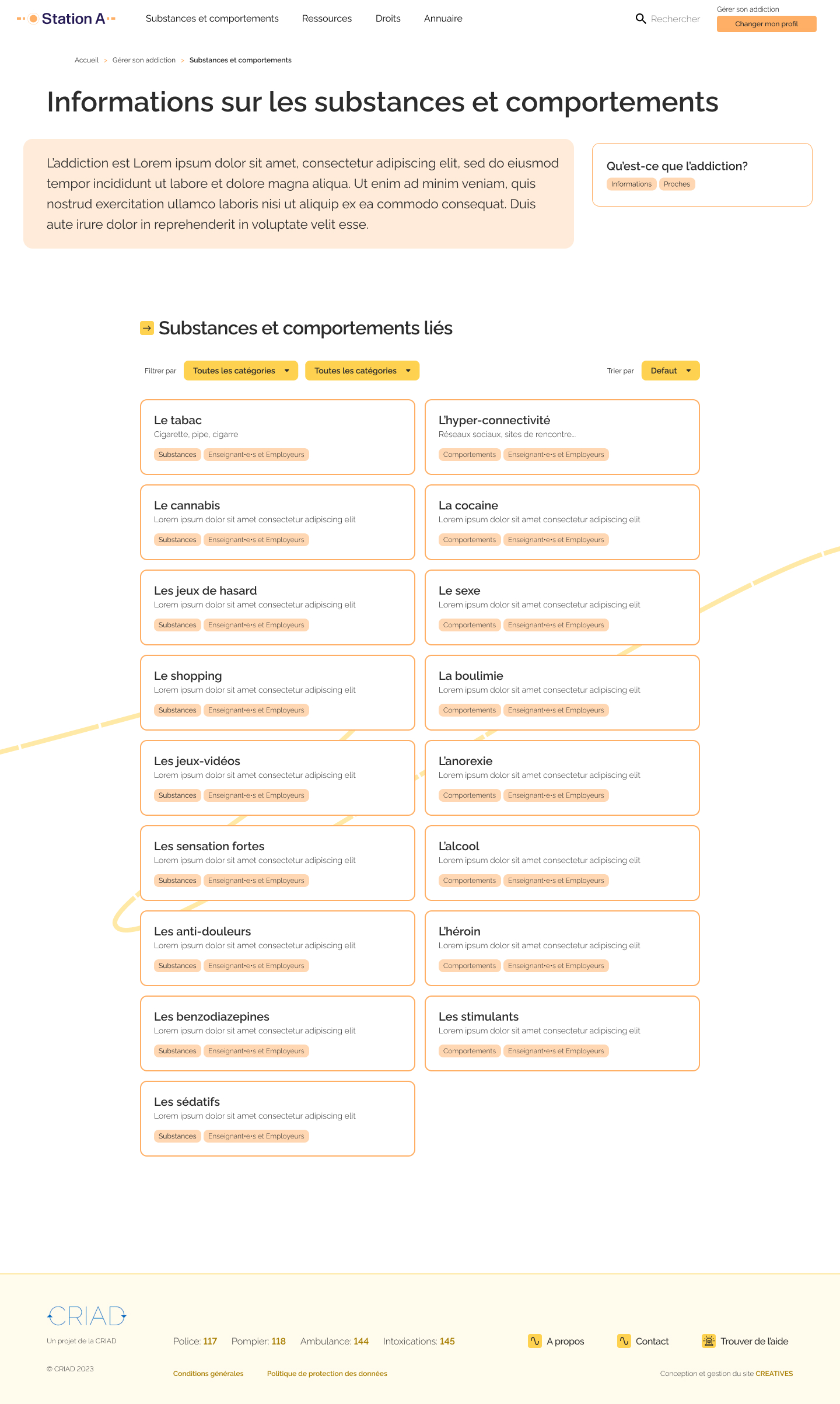
Prioritizing accessibility and trust, I crafted a robust base navigation structure. Despite the introduction of profiles, we acknowledged that not all users would opt to use them.
The content is regrouped in 5 distinct categories, prioritized through user survey analysis and extensive consultations with domain experts
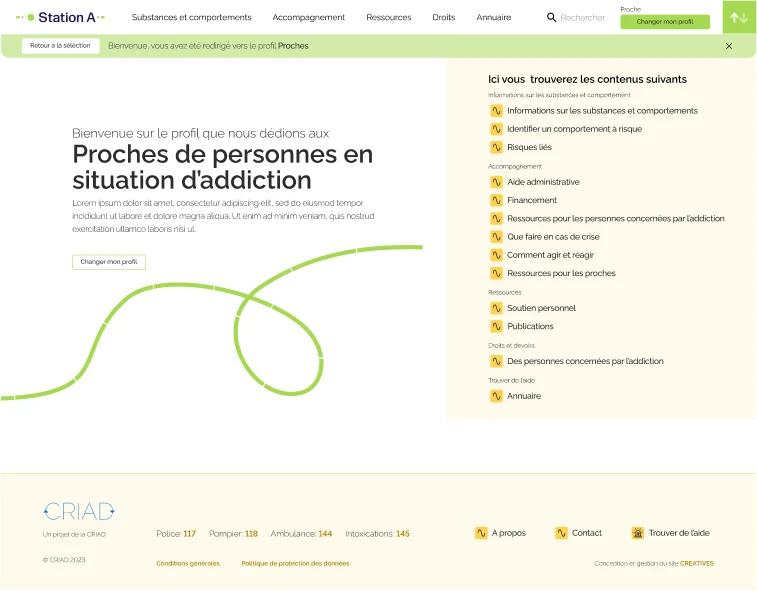
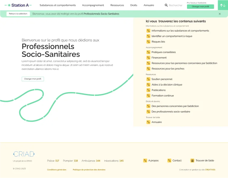
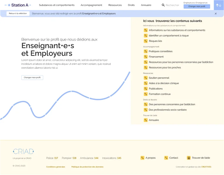
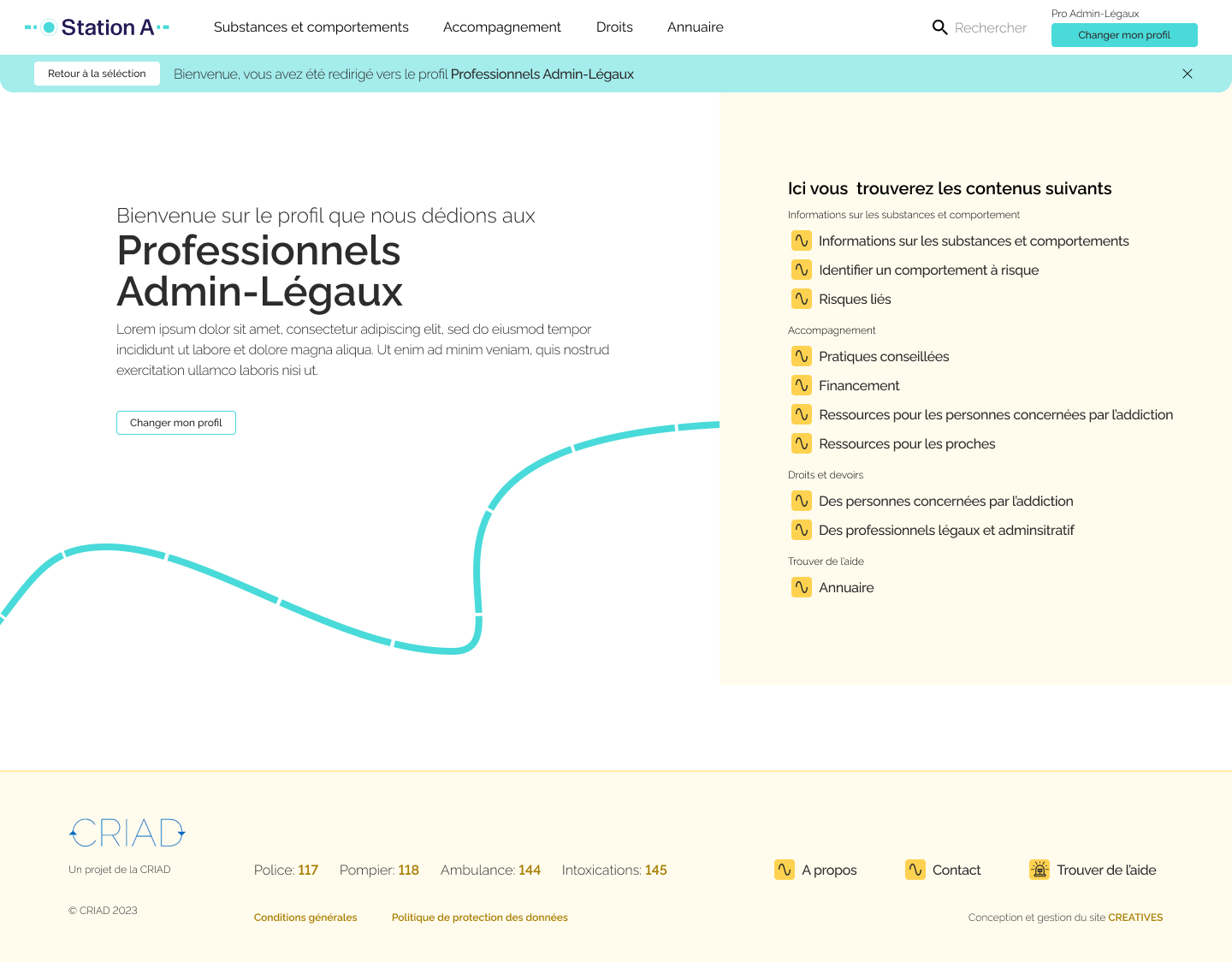
The general profile served as the foundational navigation. Then each profile only show the most relevant content to the users. Page content could be adapted to use the most fitting tone of voice for effective communication with different user groups.
Attributing the profile
Given the decision to tailor content based on user needs through profiles, the process of attributing profiles became crucial. I had to explore and get the best way to attribute them. Serving as the central point of the website, we explored and tested the following:
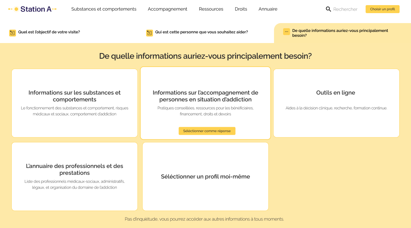
A pick and chose
A chatbot without NLP due to technical limitations
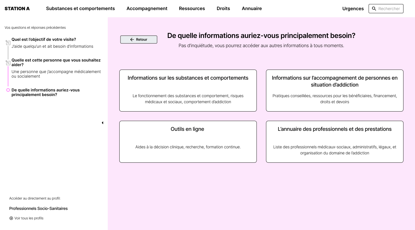
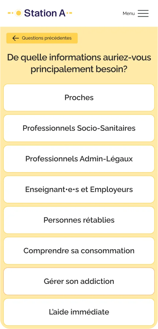
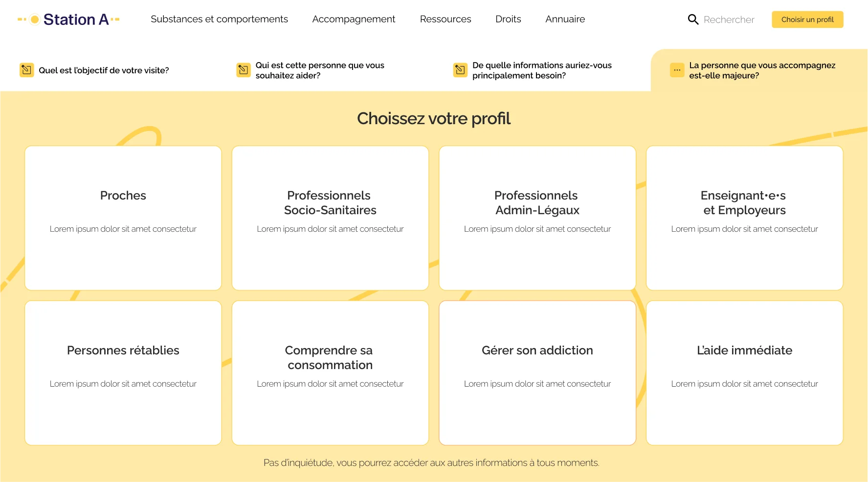
An onboarding process using a 4 level question tree
Recognizing that the system revolved around user needs, it was important to allow users to change their profiles anytime they wanted.
On top of that, once a user is on a page, we suggested related content based on their profiles, enhancing navigation ease.
User testing
We conducted two rounds of qualitative testing with 7 users to refine our question tree and identify the best selection method. User feedback validated the preference for the onboarding process and highlighted the efficiency of our navigation system. However, some users expressed feeling "claustrophobic"within the navigation system, emphasizing the need to balance guidance and user control.
Exploring different variations, adjusting control levels, and refining question clarity, we conducted a third round of testing that confirmed our last iteration. The final version provided more user control and shortcuts, allowing easy editing of previous responses or bypassing the entire tree. This resulted in an efficient navigation helper that users found enjoyable to use.
UI dEsIgn
Look & Feel
Two variations of a similar visual concept were presented:
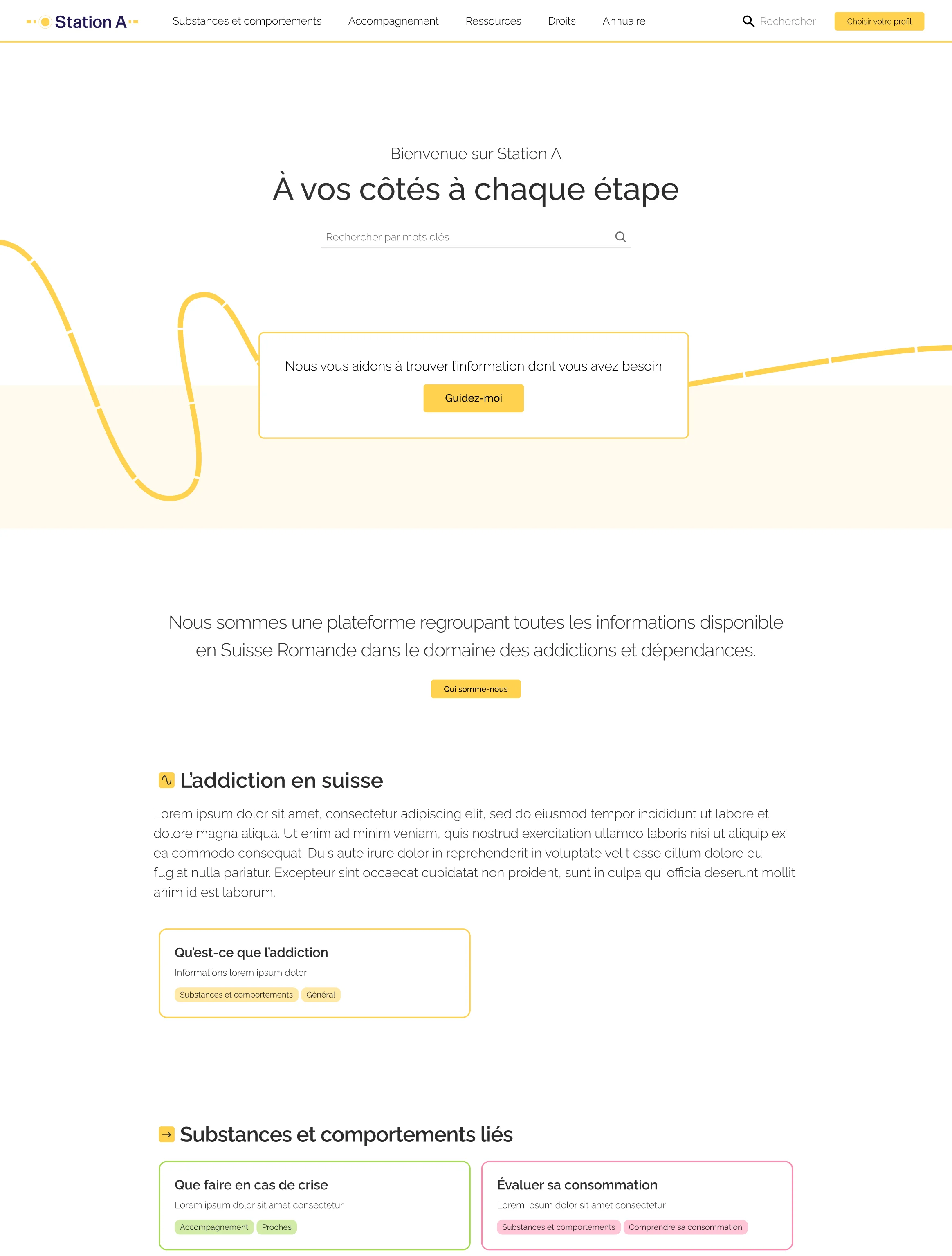
The first one utilized a line to represent the paths of individuals, all unique and originating from different places, converging at the crossroad that is StationA
The second embraced the concept of a transportation hub, particularly trains and metro travel, depicting the website as a central hub for information in the addiction space.


The visual exploration allowed for a nuanced understanding of user preferences and perceptions. From this, I elavorated a version combining the best elements of both iterations.
Helping the devs get started on the design system
Recognizing two fundamental issues from a previous project
- Decorative lines
- Spacing logic between content blocks
I proactively addressed these concerns. Anticipating potential challenges, I took the initiative to develop one content block that served as a showcase for these design principles.
This initial block then became an inspiration for the developers, guiding them in creating additional blocks and later adapting mine to seamlessly integrate within their production database.
FInaL ProdUcT
Custom design system
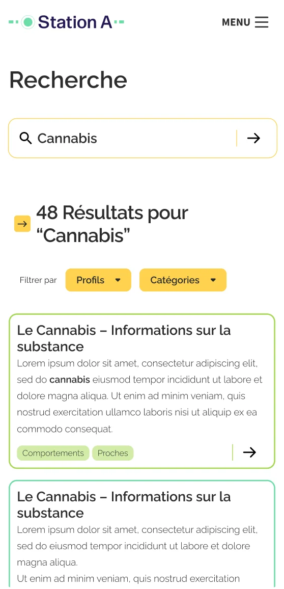
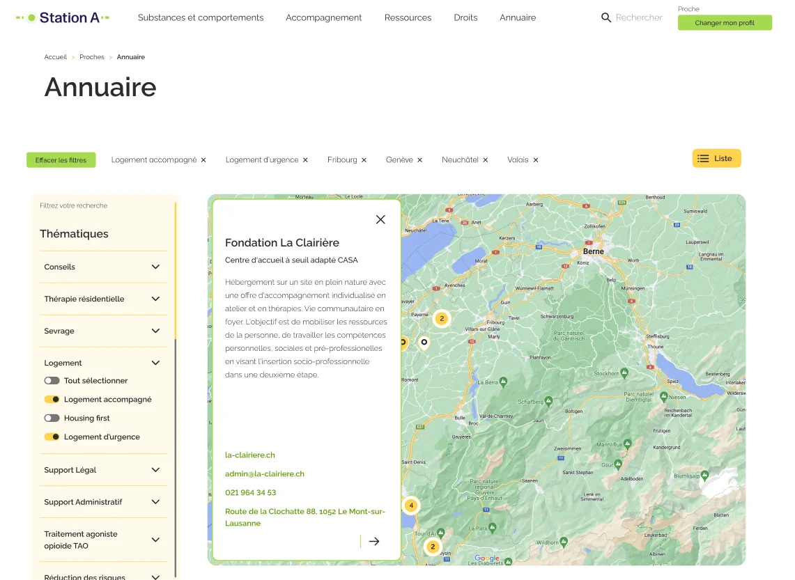
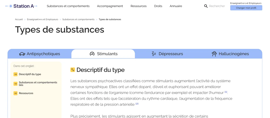
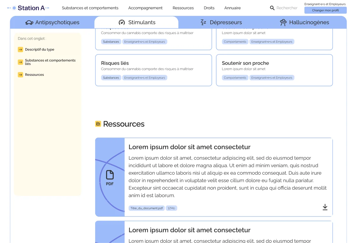
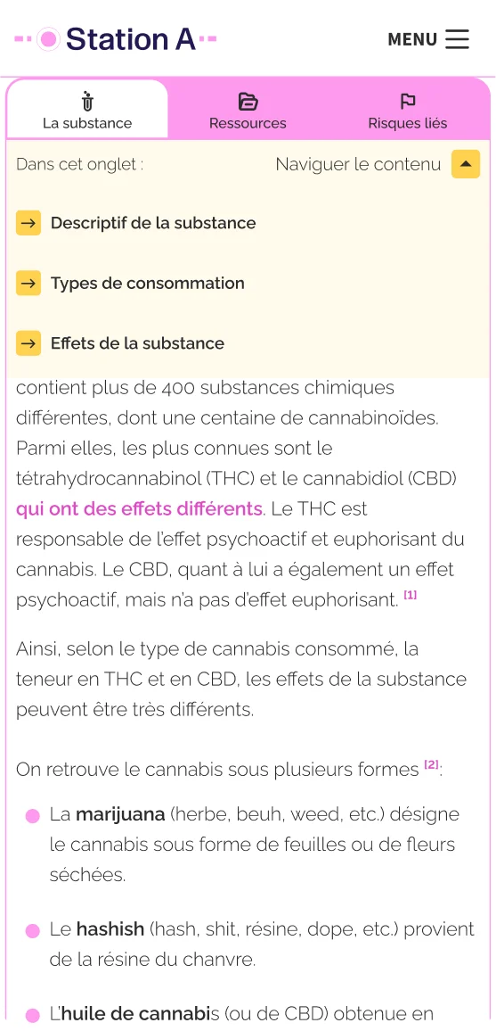
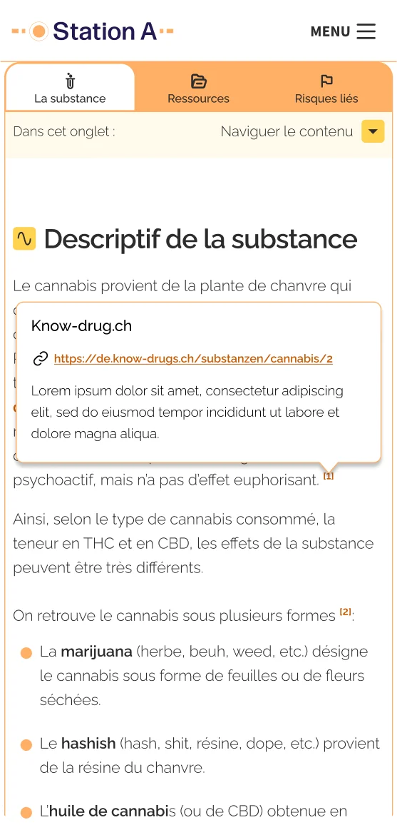
In this context the goal of a design system is to create a system of blocks, each integrated in the back-end. The goal is for the editor to be able to create any page, of any content type or length without struggling and without having to call upon us to create anything custom.
- Colors
- Navigation
- Footer
- Breadcrumbs
- Inputs
- Forms
- Paragraphs & Texts
- Highlightable Blocks
- Sources
- TABS
- Table of content
- Intralinks
- Alerts
- Simple tables
- Collapsable tables
- Introductions
- Summaries
- Highlights
- Ressources
- Testimonies
- Pagination
- Search
- Links
- Testimonies
- Tests
- Onboarding
- Basic Filters
- Advanced Filters
- Accordions
- Map
- Adresses
SLOW ROLL OUT
This project is still in development and the clients are still working on the content. The full is expected to become completed by mid 2024. I am really excited to see the results and start the after care
