hELpInG chILdrEn BY Edm
At creatives agency I revitalized Enfants du Monde's outdated website by aligning user needs with business goals. I enhanced content accessibility, emotional impact, and user engagement, ultimately strengthening the platform's connection with private donors and effectively conveying the organization's impactful mission.
Role
- Main UX
- Main UI
Tools
- Figma
Responsibilities
- UX Workshop
- Prototyping
- Visual Design
More Responsibilities!
- Illustration
- Custom design system
- General conversion strategy

qUIck ovErvIEw
Context
Enfants du Monde (EdM) is a swiss charitable association focused on assisting children in challenging circumstances worldwide, particularly in areas lacking access to education and healthcare. EdM's mission is to provide support and resources, making a positive impact on the lives of vulnerable children.
Faced with the need to shift their revenue stream towards private donors and technical difficulties with their current websites, EdM recognized the imperative to upgrade.
Problem
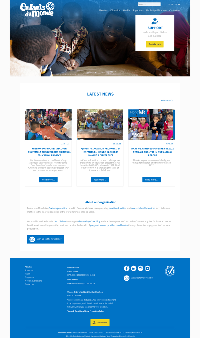
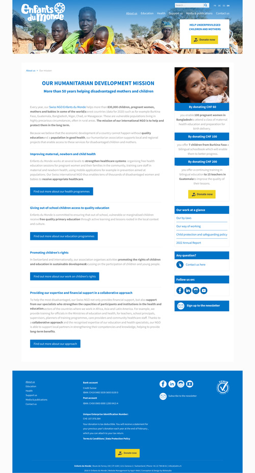
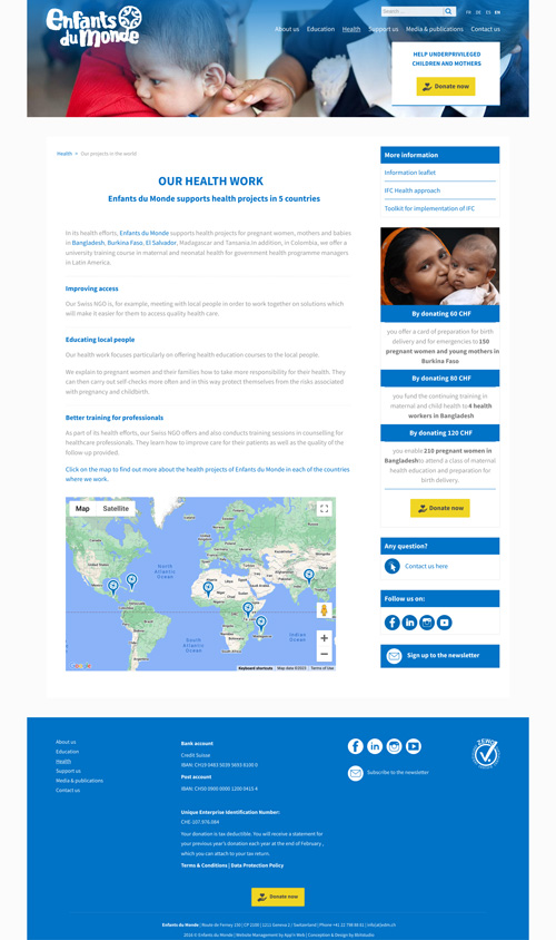
It quickly became evident that their current website appeared outdated and did not meet the standards set by other NGOs in the region. Beyond visual issues, the content was poorly organised and geared towards an institutional audience making it unappealing to private donors.
The absence of clear calls to action, user-friendly donation methods, and an overall lack of storytelling and emotional appeal in the content necessitated a comprehensive rethink to attract this new audience.
Our client's original website
Donor Users
Professional Users
Solution
To address these challenges, we initiated a complete overhaul of the website's structure. Our goal was to enhance conversion rates garner support from private donors by making EdM's message clear, easily comprehensible, and tangible.
I focused on ensuring that the content was readily accessible and emotionally impactful. A significant aspect involved effectively showcasing the positive impact they were making worldwide through impressive statistics and joyful pictures.


UX dEsIgn
Discovery workshop & User testing
The UX director and I conducted a workshop with stakeholders to delve into their projects, business needs, and gather data from the current website. Through this process we gained insights into their target users and identified areas for an improved user experience.
Before the website update, the EdM team conducted interviews with users from institutions, the education sector, and individual donors. This process revealed several key pain points:
- Confusing navigation lacking centralization
- Excessive text with insufficient emotional imagery
- Hard to scan wall of text
- Weak storytelling
- Results and impact only available in the annual report
Understanding these pain points enabled me to prioritize and address these critical areas during the website redesign process.
Solving navigation with a content organization workshop
In a collaborative workshop, EdM provided the existing sitemap and brief descriptions of each page. They also presented a draft of a new sitemap and navigation structure. I had to make sure that every aspect of their activities was considered while prioritizing them.
Working closely with their team, I delved deeper into the challenges and requirements. Through active participation and discussion, we successfully crafted a robust and intuitive navigation system that not only addressed the identified pain points but also aligned seamlessly with their goals.
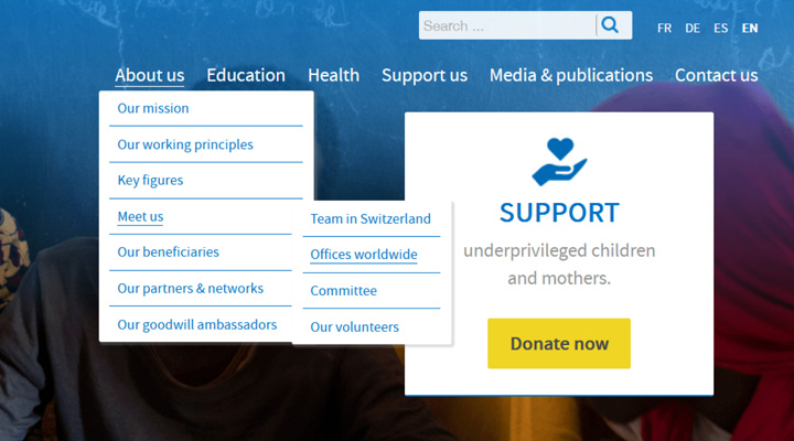
Old About menu
The Mega Menu approach
I implemented a mega-menu to ensure instant accessibility to every page from any point on the website, replacing the previous system with up to 5 navigation slates. Each section now has a dedicated "hub" page, summarizing the subject and guiding users to additional details on other pages.
The navigation labels now clearly represent their three main areas of expertise, and I emphasized their extensive international presence.
Additionally I disseminated testimonies & numbers across relevant pages, I aimed to enhance their impact and emotional resonance within the broader context

Reworked About menu
Linking the theoretical content to case studies on the terrain
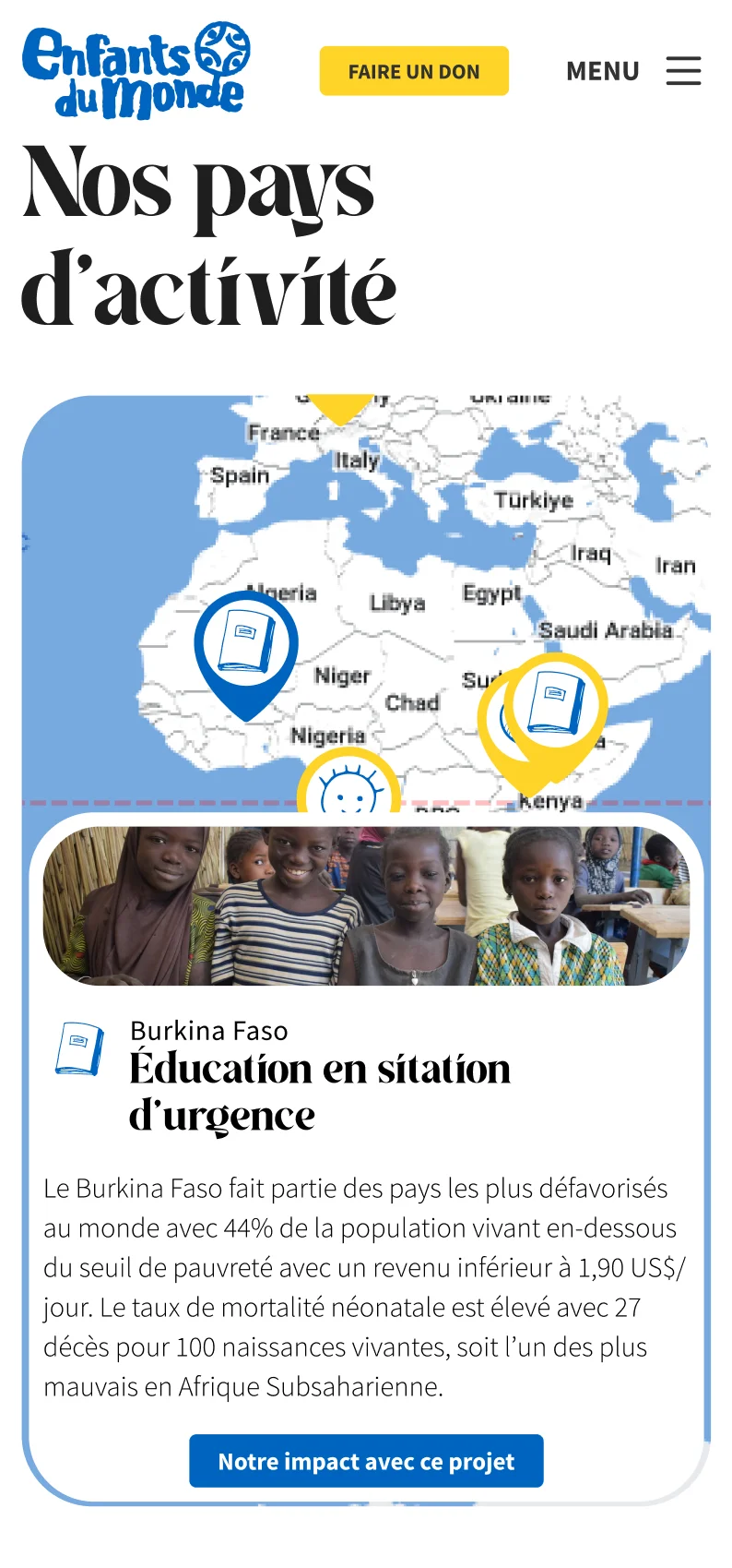
To vividly illustrate the impact of EdM's work and encourage donations, I introduced a new section with country-specific pages. These pages delve into local challenges and spotlight the association's projects in each region.
This shift from theoretical content to practical case studies enabled visitors to witness the tangible results of EdM's efforts, fostering a stronger connection to the cause.

Letting their impressive numbers speak for themselves

Showcasing relevant projects in the theoretical pages
Providing easy access to detailed documents
In response to the constant need for rapid document access from institutional fund providers, I created a dedicated general library on the website. Additionally, I explored various methods to integrate relevant documents directly onto corresponding pages. After careful consideration, After careful consideration, I introduced a toggle at the very top of each page, displaying the related document, thus allowing users to easily access them contextually.
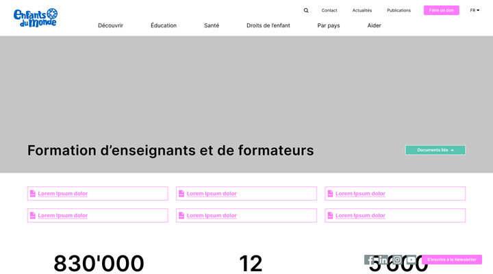
Proposition having a subtle toggle in hero for easy access
UI dEsIgn
Visual iteration
While working on the UI design, we took the client's existing visual identity into consideration, aiming to maintain some consistency while modernizing it. However, after countless hours of work, it became apparent that we needed to steer the project towards a more modern and expressive path to achieve memorable results and increase conversion


Icons creation
he icons played a significant role in the overall concept. Designed to resemble drawings made by children, they served as a callback to the organization's mission, aiming to infuse the content with a warmer and more approachable feel.
Website upkeep
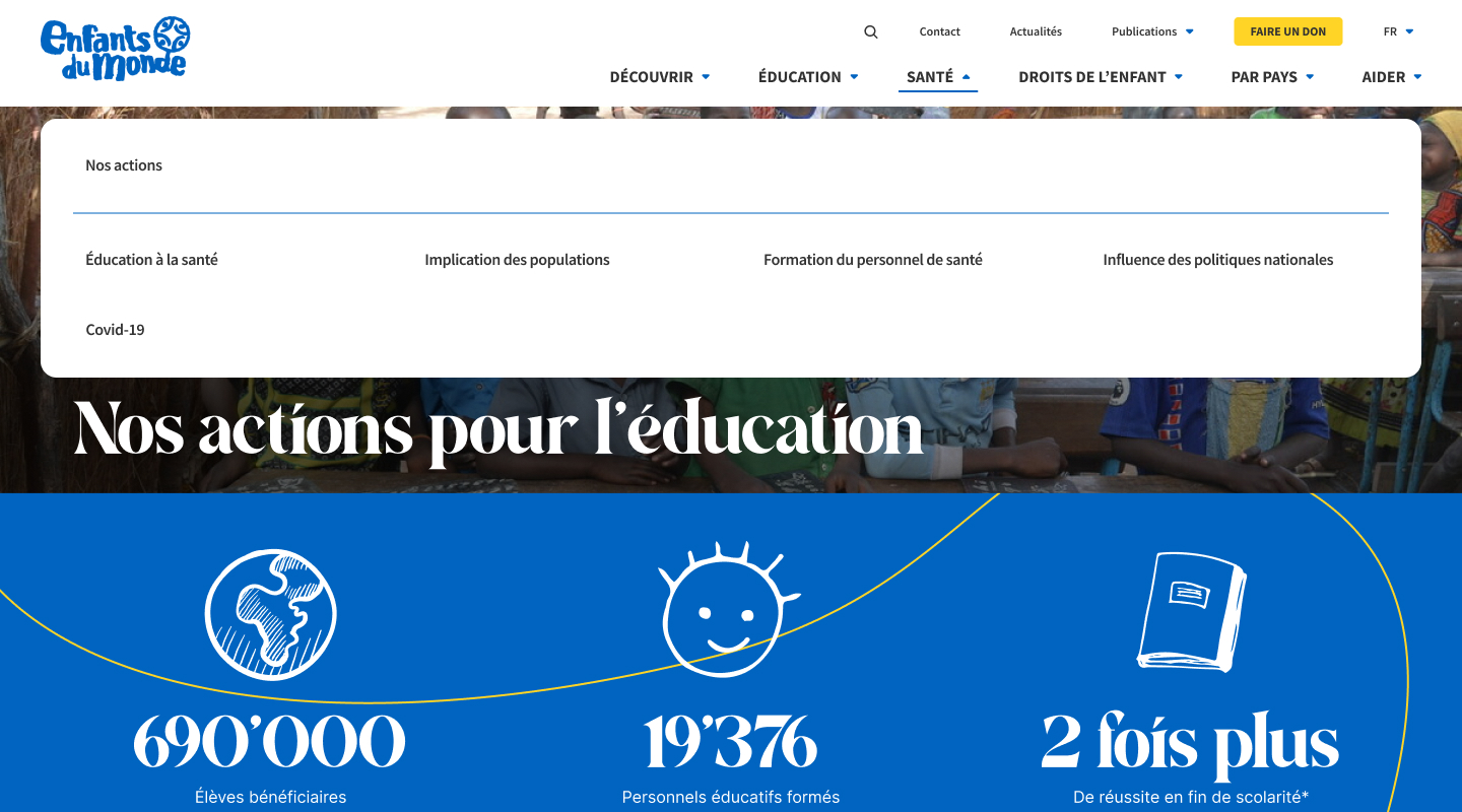
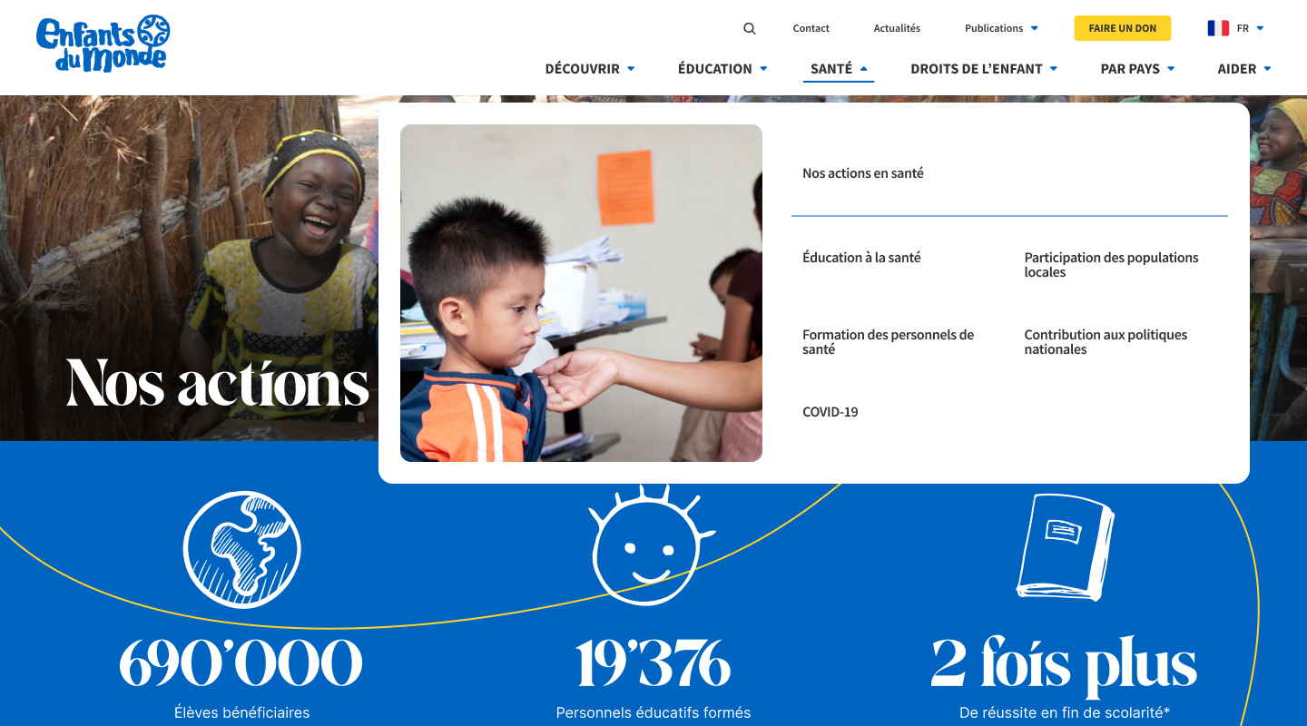
The only major changes that occurred since the design phase were in the desktop menu. The client expressed a preference to remove icons from the menu, citing concerns about it looking too busy. In the rush of the release, there wasn't much else to do than to comply with their request and simply remove them.
Additionally, the menu faced the classic Mega Menu issue, where accidentally hovering over an adjacent menu while trying to click on a link inside triggered the adjacent menu list.
As soon as we had some time after the initial release frenzy, I revisited the drawing board and devised a few solutions.
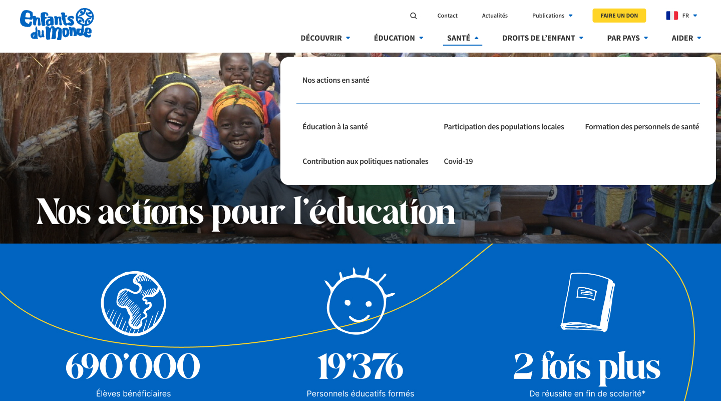
FInaL ProdUcT
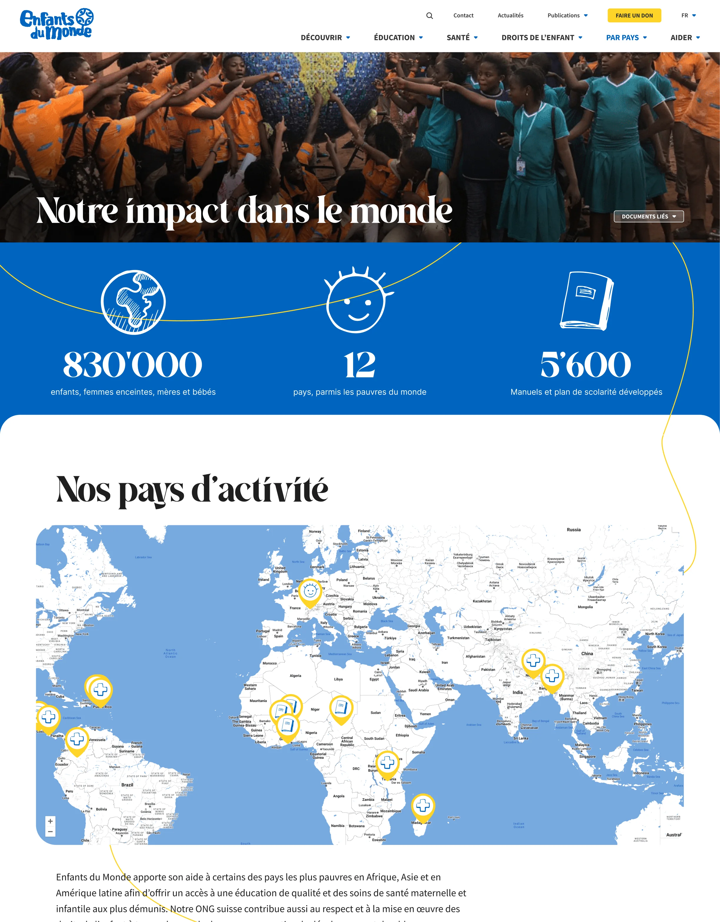
61 PAGES - custom design system
- Hero
- Navigation
- Sections
- Actualities
- Map
- Text + images
- Images
- Accordions
- Team members
- Lightbox
- CTA
- Filters
- intra-links
- Testimonies
- Galleries
- Highlighted pictures
- Job post
- Forms
- Documents
- Articles

STATS COMING SOON
Being quite a recent project, it is too early to know if any stat is to be attributed to the redesign or the business cycle.


