dEsign X
FronTEnd
With our tech-lead at creatives agency I successfully tackled communication challenges between design and development teams by introducing collaborative processes, revamping design documentation, and implementing a component-based approach. These changes significantly improved front-end quality, enabling us to handle complex projects and diverse client needs a lot more efficiently.
Role
- Facilitator
- Figma Lead
- Design system Lead
Tools
- Figma
- Wrike
- Css
- Javascript
Responsibilities
- Design handover process
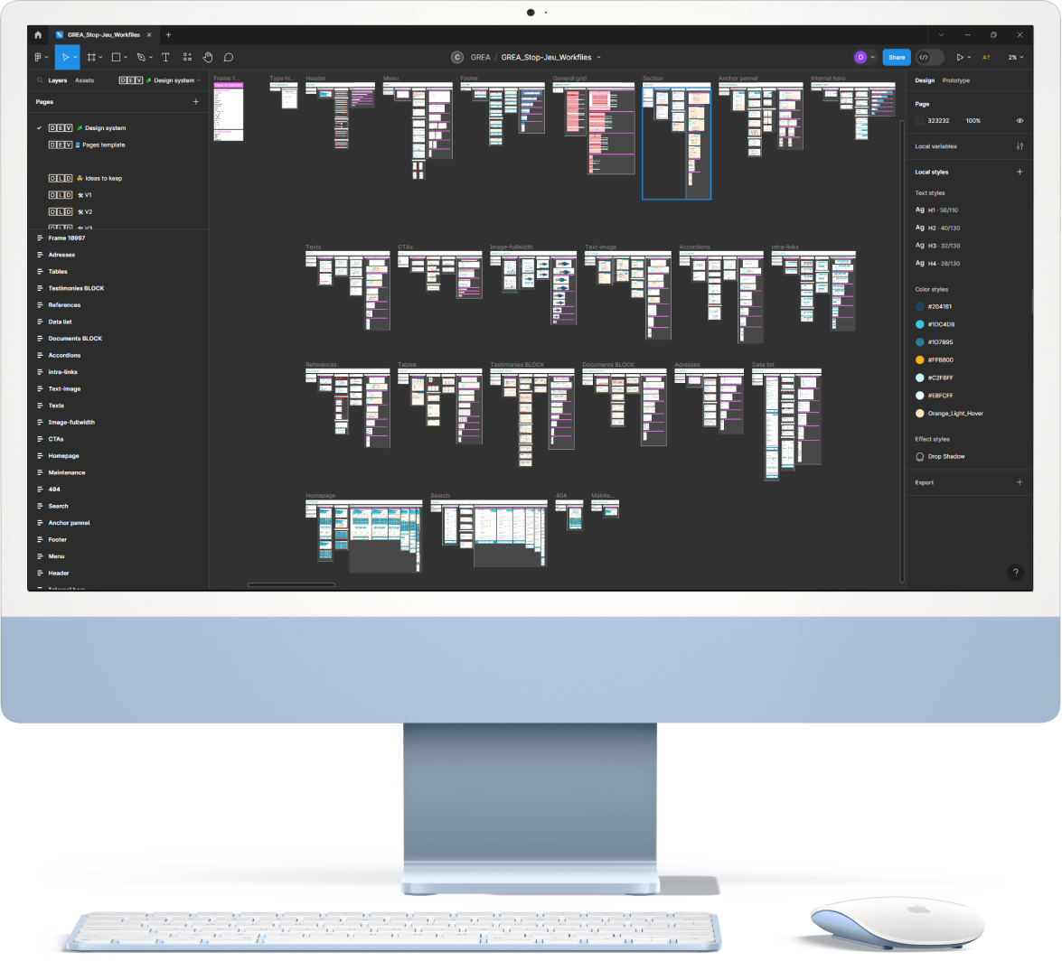
- Figma file organizazion
- Design systems
- Design dev coordination
qUIck ovErvIEw
Context
creatives agency, is a 360° marketing agency based in Lausanne Switzerland. They focus on creating communication strategies, selling ideas, and promoting business online and offline. At this company I was focusing on website and was the main UX/UI designer.
Problem
A significant issue was the evident lack of communication between the development and design teams. The workflow typically involved the design team creating assets, passing them to developers, and expecting the final product without any collaborative input. This led to several problems:
- Low-quality development due to unclear design requirements.
- Extensive time spent on quality assurance (QA).
- Client dissatisfaction due to discrepancies between expectations and final delivery.
- Non-compliance with accessibility and general web standards.
- Inconsistencies in the breakpoints of the website design.
Solution
A significant part of the solution came from the Tech Leadership, which revamped the development process. We also agreed that we needed both tech and design to work together from the start, review wireframes together, and make sure none of the functionalities and visuals were out of scope. On my side I restructured our design documentation, incorporating several crucial elements
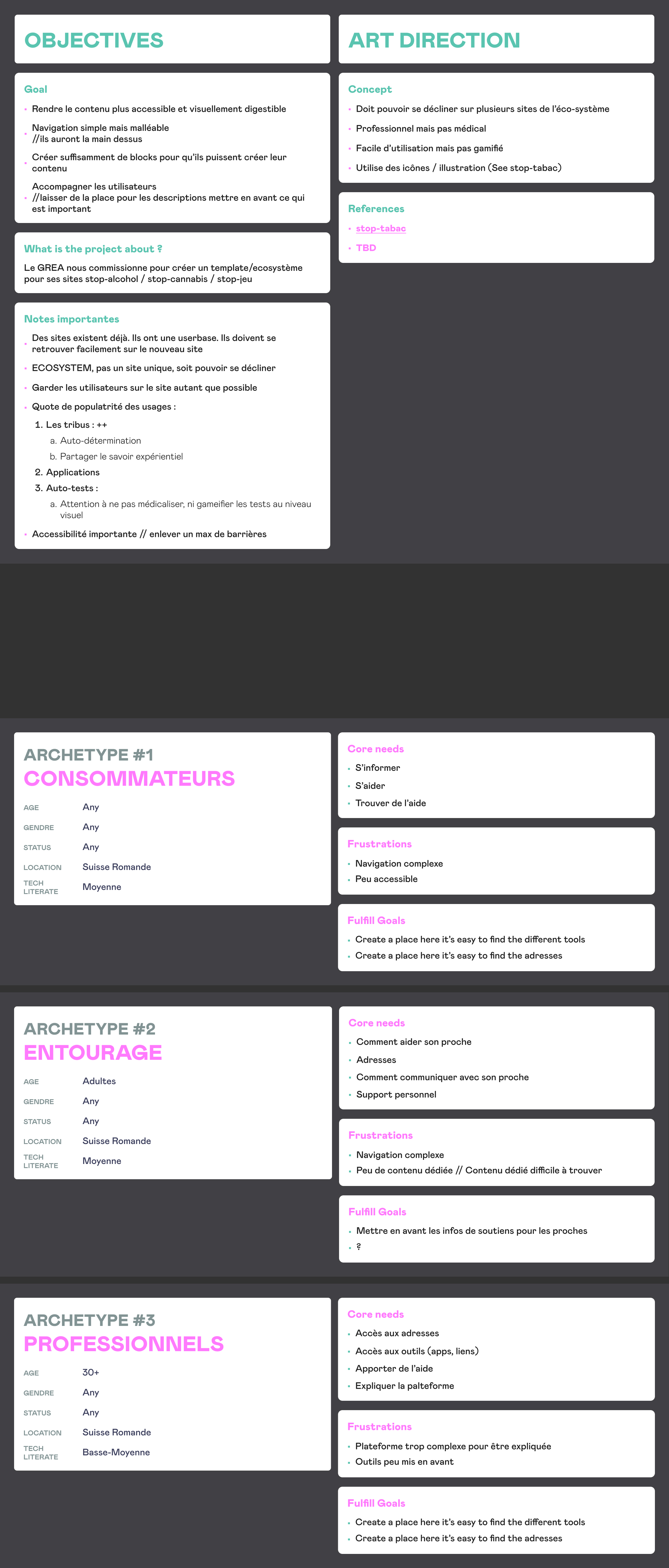
- Clear articulation of project goals and user persona
- Creation of comprehensive sitemaps and user flows
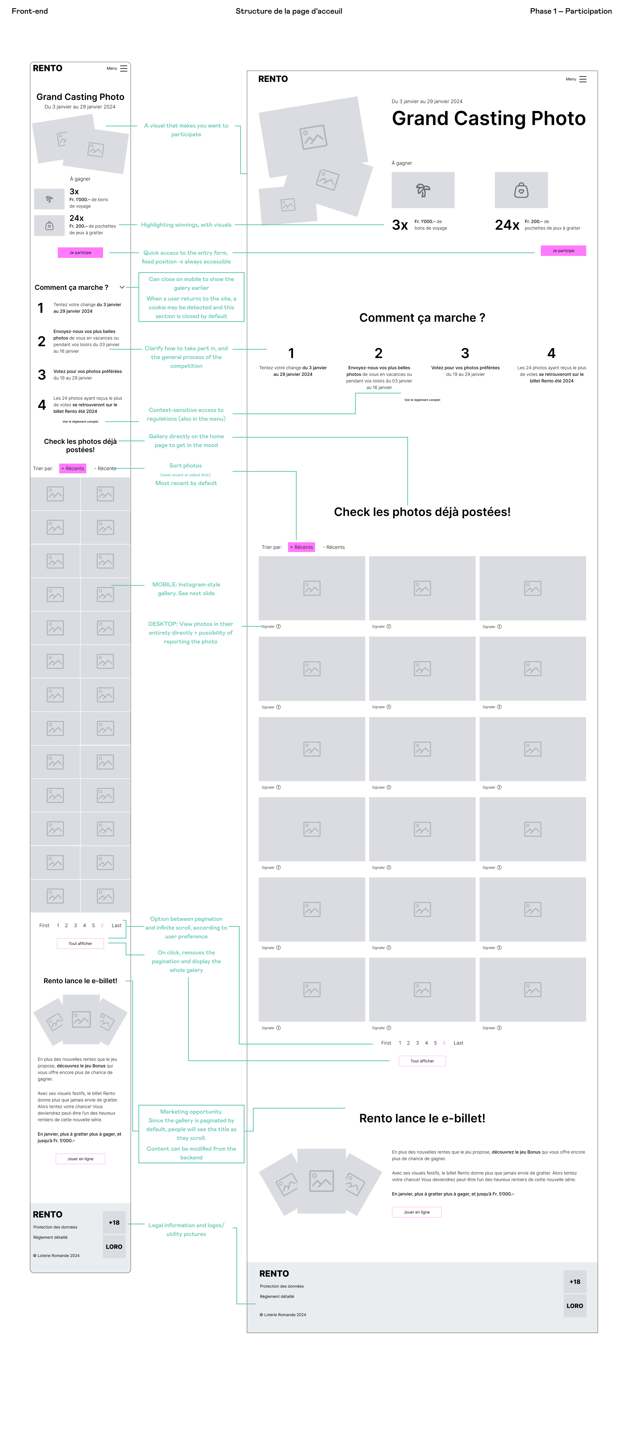
- Detailed wireframe documentation encompassing all functionalities
- Explicit depiction of interactive element state
- Storyboarding for animations and providing relevant examples
- Implementation of up to seven different breakpoints for responsive design
- Introduction of a design system logic
- Creation of manageable development tasks in Wrike, linked to Figma for reference
- Initiation of kickoff, review, and handover meetings for continuous alignment
- Encouragement for developers to ask questions and contribute ideas throughout the process

dETaiLEd SpEciFicaTion
Style Guide & Over the wall
The existing process, in place before my arrival, involved a siloed approach between Tech and Design. Tech's involvement was limited to selecting the technology at the project's outset, and they were not engaged until they received the following documents from Design:
- Barebone styleguide
- Desktop (1440px) & mobile(360px) designs
- Figma comment for backend integration
Every element on every page was custom-made to suit specific content, discouraging the development of reusable code. This led to challenges when clients sought changes in elements down the road.
Positives
- Rapid design pace
- Aesthetic focus resulting in potentially visually appealing websites
Negatives
- Custom coding for each content element
- Design would come up with solutions outside of the project scope
- Every project had a lot of feature creep
- Limited ability for multiple teams to work in parallel
- Frustration for clients during update requests
- High QA time
- Frequent conflicts between Design & Tech
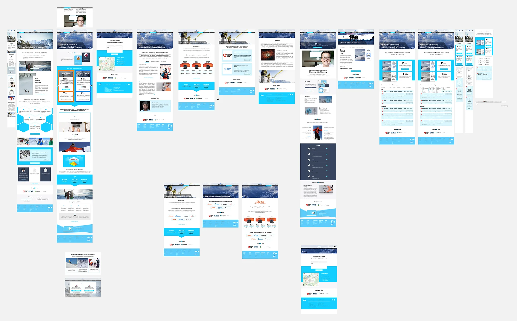
Snipset from the website creatives.com made for WEMountain
Tackling Responsive & Behaviors
To address feature creep and foster alignment, wireframes were collaboratively developed with Tech Leadership.
Leveraging Figma's capabilities, I adopted a component-based approach to document designs, utilizing auto-layout to efficiently generate multiple breakpoints. The enhanced handover now included:
- Explicit behavior for all interactive elements
- 8 breakpoints (2560, 1920, 1440, 1024, 720, 414, 320)
- An exposition of each components
- Basic components for generic content pages
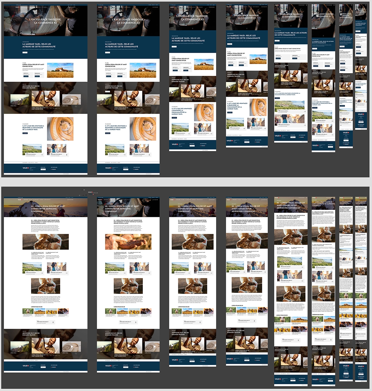
Snipset from the website creatives.com made for Vaud Promotion
Positives
- More time to focus on principal pages
- Improved results in responsive development
- Encouragement for developers to build reusable components
- Shared understanding of what needs to be built between Design & Tech
Negatives
- Limited communication beyond wireframes
- Absence of a platform for developers to contribute ideas
- Lack of integration with the content or marketing team
- High QA time
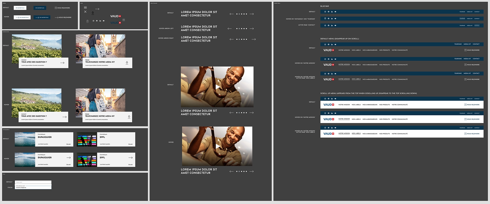
Snipset from the website creatives.com made for Vaud Promotion
opEn CommUnicaTion
Handover meeting & Story Boards
To familiarize developers with the component-based approach, we introduced handover meetings where design and underlying logics were presented, fostering open communication for any questions.
- Explicit behavior for all interactive elements
- 7 breakpoints (2560, 1920, 1440, 1024, 720, 360)
- An exposition of each components
- Basic components for generic content pages
- Storyboard to explain complex behaviors
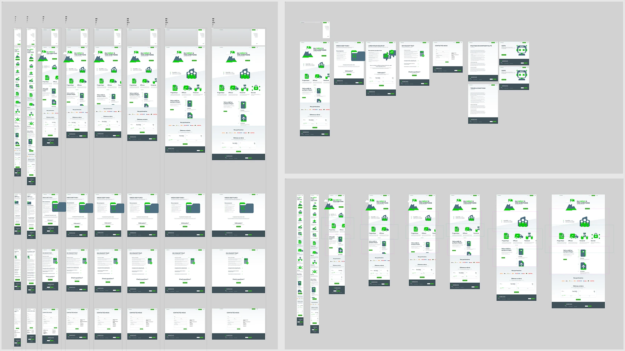
Snipset from the website creatives.com made for Kredo
Positives
- Rapid work facilitated by component usage
- Responsive design became more manageable
- Meetings encouraged dialogue between designers and developers
- A sense of team spirit evolved through mutual understanding
Negatives
- Overemphasis on components
- Insufficient focus on explanation and providing examples
- Poorly explained complex behaviors
- Limited questions raised during meetings
- High QA times
- Disconnect between components & responsiveness

Snipset from the website creatives.com made for Kredo
Website categorization
During this period, I started floating the idea of categorizing our services into 3 categories of client customization. The goal was to simplify the process and propose the best solution for each client:
- Full custom tailored to a specific content, only providing minor cutomization opportunities
- Creation of a custom template, repeating some pages styles & offering options
- Design system based, empowers the client with total control over content, page flow, and navigation
Constantly aligning the vision
Recognizing the benefits of continuous collaboration, we decided to push it further. Taking a comprehensive approach by integrating Tech and Design into every project step. This involved initial kick-offs, frequent reviews, prototype creation for intricate elements, and fostering an environment for developers to contribute insights and suggestions.
- Explicit behavior for all interactive elements
- 7 breakpoints (2560, 1920, 1440, 1024, 720, 414)
- Exposition of each component
- Showcasing edge cases
- Standard grid
- Storyboard to explain complex behaviors
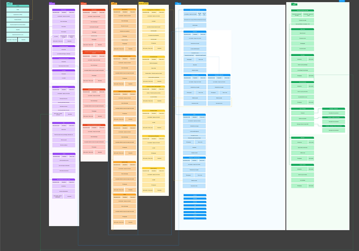
Snipset from the website creatives.com made for Enfants du Monde
Positives
- Simultaneous work on front-end and back-end
- Responsive design ceased to be a problem
- Reduced front-end QA time
- Skyrocketing improvement in front-end quality
- Diverse solutions emerged from all team members
- Prototyping enabled anticipation of potential issues
Negatives
- Lack of dedicated back-end specifications made issue identification challenging
- Documentation became time-consuming and unruly
- Easy for developers to miss elements in the chaos
- No checks on the design team to ensure nothing was overlooked
- Loose interpretation of wireframes
- Challenges in implementing a more complex design system properly
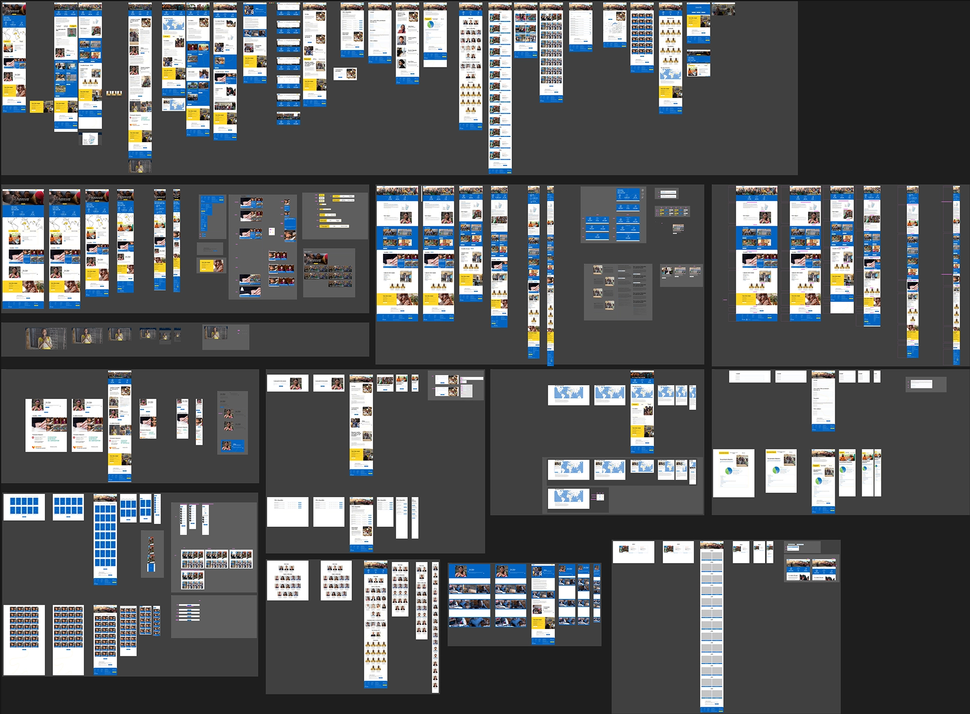
Snipset from the website creatives.com made for Enfants du Monde
dEsign sYsTEms
Focus on design systems
Recognizing the significance of getting complex design systems right, I embarked on a mission to enhance documentation further. Discussing the issues with developers revealed that, instead of creating blocks and building pages, they were constructing entire pages first and then attempting to break them down into blocks for integration.
This process explained why the majority of issues only got visible after back-end integration. I solved it through a mix of education breaking down QA into blocks as well, while having a more thorough QA after back-end integration & content insertion.
- Annotated wireframe document serving as a base for everything
- Exposition of each component
- Grouped responsive and behavior information
- Easy-to-digest Wrike cards for each block
- Standard grid
- Highlighted important information on each block
I also instituted regular reviews with the front-end team, engaging them more in decision-making and fostering collaboration and question-asking. The wireframe document emerged as a crucial innovation, providing everyone with constant project updates. This shift alleviated the burden on designers to remember every important aspect.
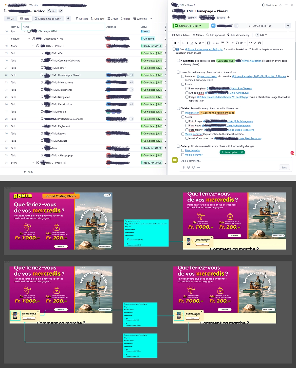
Snipset from the website creatives.com made for La Loterie Romande
Positives
- Simultaneous work on front-end and backend
- Responsive design challenges resolved
- Minimal fire-extinguishing QA time, enabling a focus on accessibility
- Maintained high front-end quality
- Solutions emerged from various team members
- Prototyping continued to anticipate potential issues
- Increased collaboration and problem-solving efficiency
- Complex problems could now be efficiently tackled
- Design decisions were challenged by team members
Negatives
- Files really got out of hand
- Difficulty navigating design files without Wrike
- Time-consuming documentation and coordination meetings
- Duplicated information between Wrike and Figma
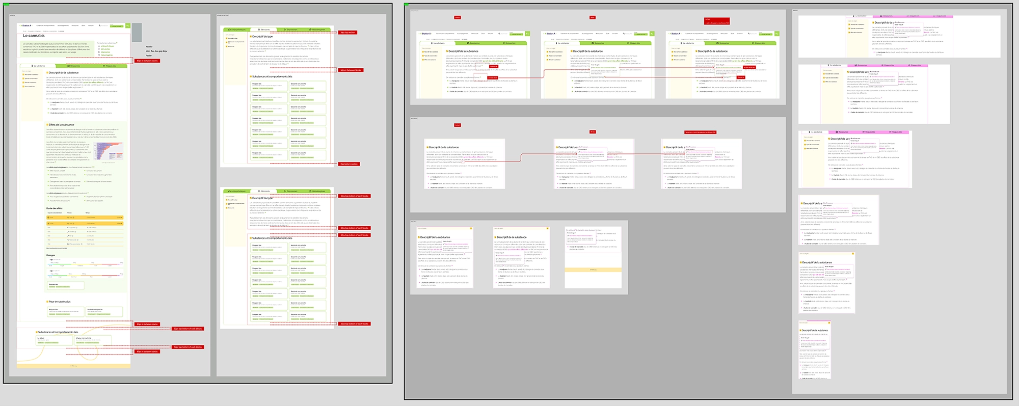
Snipset from the website creatives.com made for Kredo
Hitting that sweet spot
With most elements falling into place and the Design and Tech teams working efficiently on big and complex projects, a new challenge emerged — other teams were left behind.
The emphasis on documenting designs for developers created files that were unfriendly to anyone outside the project. This prompted a reassessment of Figma file organization, leading to the following propositions:
- Highlighting strategy, objectives, and users
- Including a sitemap for each website
- Making the annotated wireframes central to the document standard
- Providing visual guidelines for other designers to easily jump in
- Designating a space to showcase the UI for non-tech team members
- Detailing each block in the design system along with its specifications
- Indexing each block and showing dependencies to facilitate navigation
- Displaying page templates akin to building instructions
- Keeping a separate versioning file to maintain a manageable file weight
This reorganization aimed to make the project overview accessible to anyone at any time without feeling overwhelmed by a tangled mess of Figma sections.
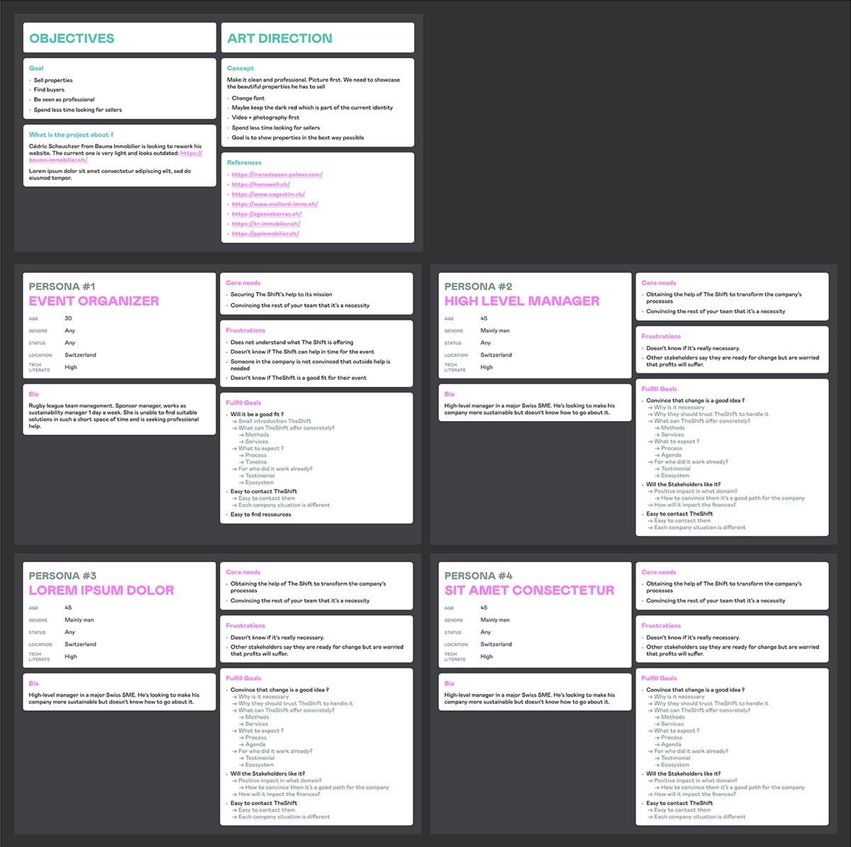
Snipset from the website creatives.com made for The Shift
Positives
- Boosted morale with cleaner files
- Important information available at a glance
- Standardized Figma file organization across the board
- Encouraged research and documentation
- Fostering a sense of responsibility when the "reference" section is empty
- Increased inclusivity for other teams in projects
Negatives
- Time-consuming documentation process

Snipset from the website creatives.com made for Enfants du Monde
Final word & results
I am sincerely grateful to the team at creatives.com for entrusting me and my vision with this project. The outcomes and improvements speak for themselves:
- Development quality witnessed a significant and noticeable improvement
- Client satisfaction experienced a substantial increase
- QA time was cut in half, providing room to focus on details and accessibility.
- The team's efficiency soared, allowing the creation of 25 blocks in the time it previously took to produce 10
- Team familiarity with Figma rose, enhancing collaboration and understanding
- The team's capability to efficiently solve complex problems skyrocketed
These results reflect the positive impact of a collaborative and streamlined approach, showcasing the benefits of aligning design and tech teams from the project's inception to its completion.
Snipset from the website creatives.com made for WEMountain