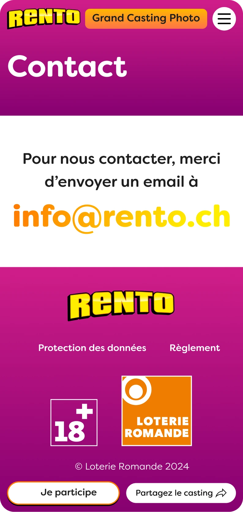
phoTo ConTESt BY LoRo
At creatives agency I led the design of a dynamic platform for a photography contest, ensuring an engaging and user-friendly experience, both for the front-end and the backend. Overcame challenges in balancing client preferences with optimal user interactions, resulting in a visually bold and playful interface that successfully facilitated voting phases and managed submissions.
Role
- Main UX
- Main UI
Tools
- Figma
- Javascript
Responsibilities
- UX Workshop
- Prototyping
More Responsibilities!
- Visual Design
- Backend

qUIck ovErvIEw
Context
LoRo is the organization overseeing lottery products in French-speaking Switzerland, managing a diverse range of games. Annually, they conduct a photography contest to source assets for the design of their lottery tickets. Our task was to create a web platform to host this contest.
Problem
The previous agency handling this mandate performed poorly, emphasizing the need to showcase our competence and professionalism.
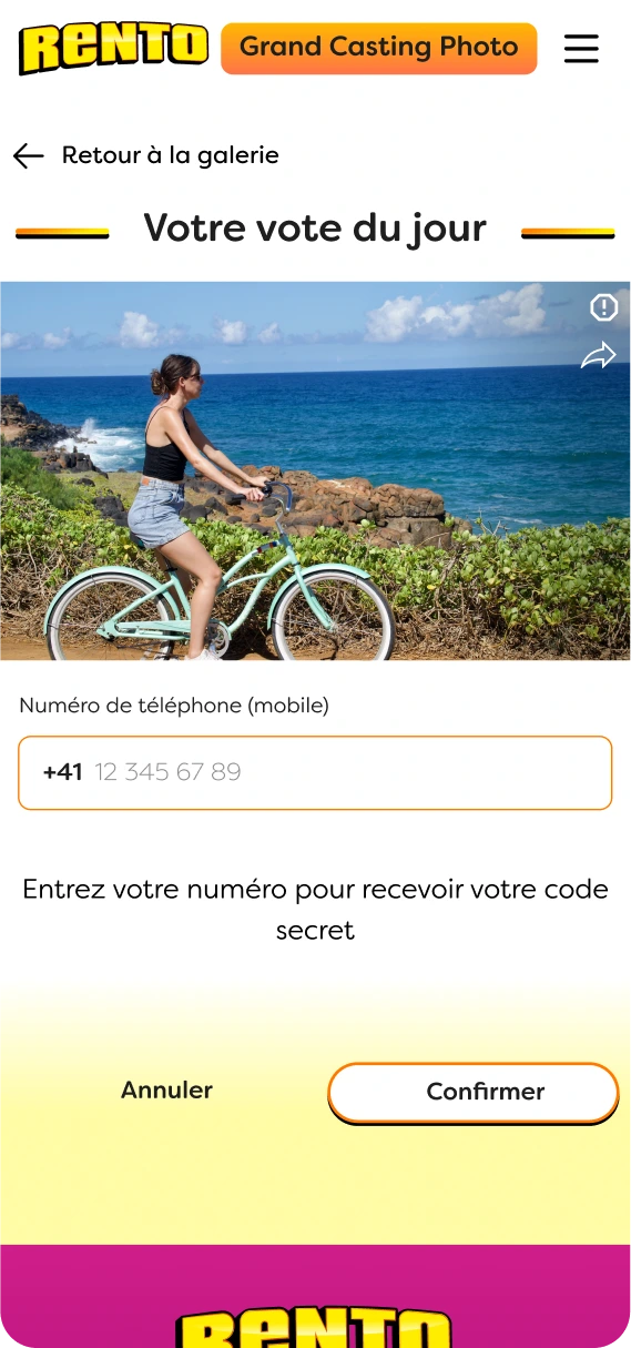
The contest unfolded in three phases: participants submitted photos, the public voted for their favorites from a selection of 100, and finally, the top 24 pictures were chosen and displayed on the website.
Front-end users
Backend Users
Solution
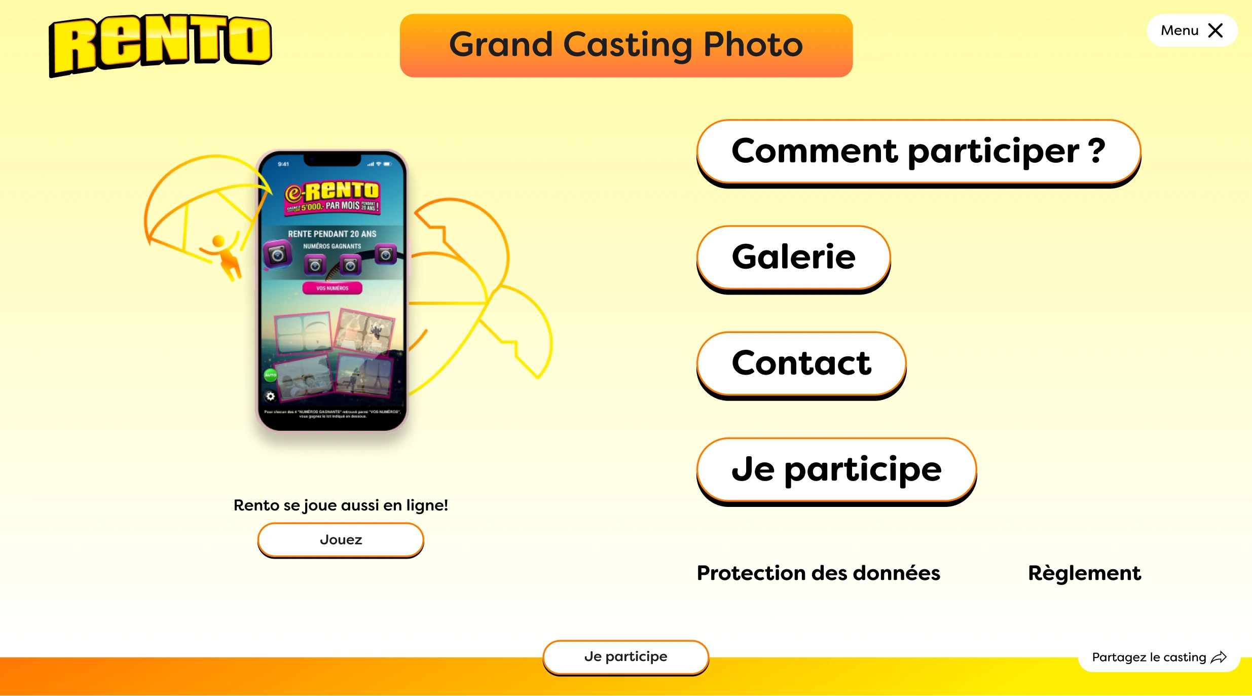
We developed a website framework that seamlessly supported the requirements for each contest phase with minimal changes. I aimed to keep the design simple and straightforward while infusing it with a fun and exciting look.
On the backend, our focus was on usability and security. Working closely with the clients, who would directly use the backend, proved beneficial. This dual perspective streamlined the evaluation of priorities and requirements, enabling me to create a tailored solution aligned with their preferences.


UX dEsIgn
Setting up the expectations
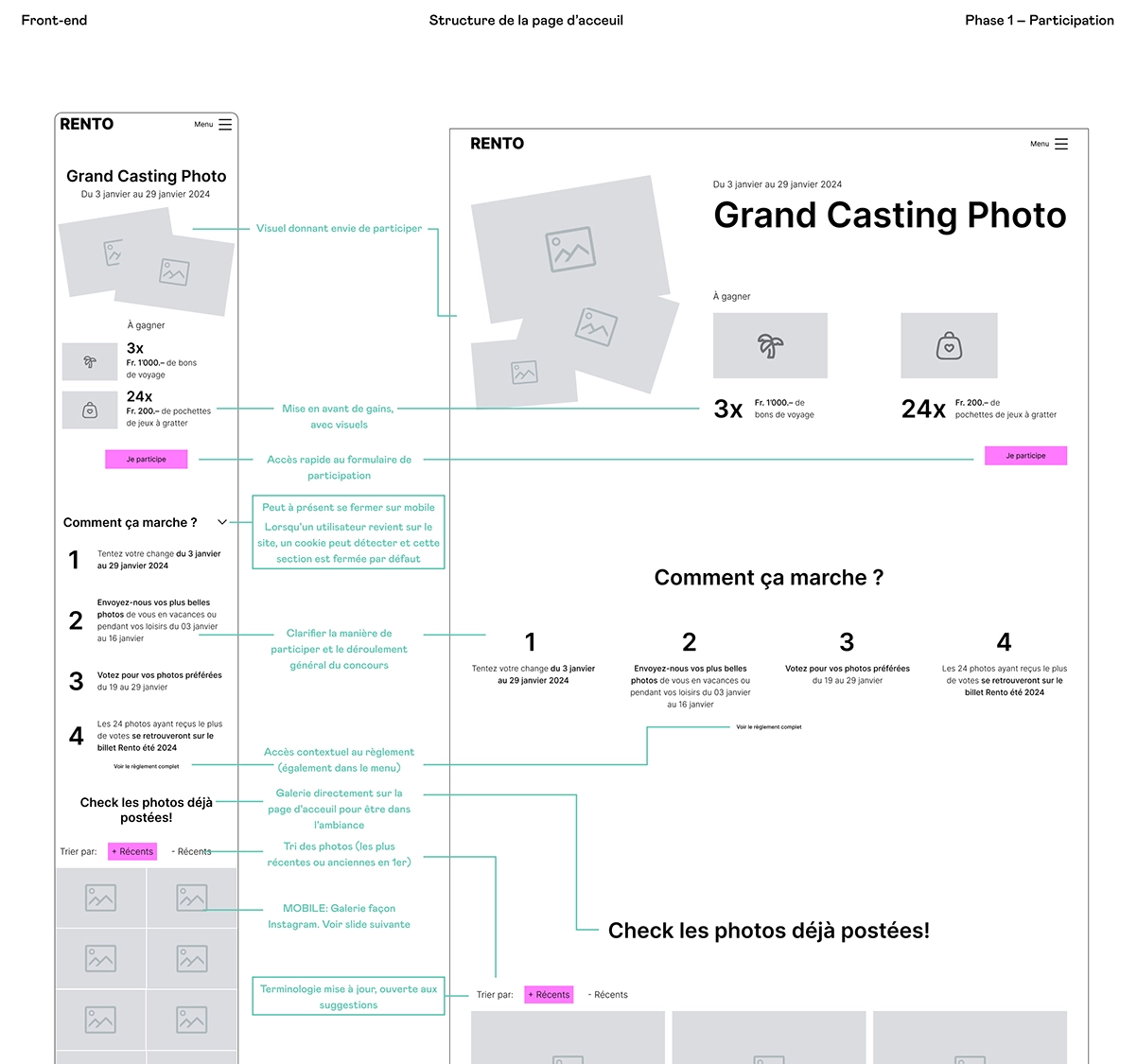
Given the remarkably short timeframe of three weeks for the entire design process, rapid agreement on the website and backend functionality was crucial. I seized this opportunity to innovate the wireframing process, creating a comprehensive document detailing each functionality and the rationale behind them.
This ensured that the client, developers, and designers were all on the same page with a reference document. The client was impressed by the efficiency and professionalism demonstrated.
Solving the backend
Collaborating with my technical director and project owner, we conceptualized a straightforward backend structure centered around a list of pictures. This setup allowed users to:
- View pictures, along with their status and information at a glance
- Choose to accept (displayed on the website), refuse (not displayed), or preselect (dispalyed and added to a favorite list)
- Utilize multiple folders whose content could be modified based on the current contest phase, facilitating documentation
- A special folder to handle reports
- Oversee votes and intervene in case of suspected fraud
- Switch the contest phase
- Change some of the conten
This approach facilitated a swift review of the picture list, enabling the rapid identification of the best ones. The favorite list feature allowed for the pre-selection of 100 pictures as they were submitted, streamlining the process rather than navigating through 4000 pictures at the contest's end.

Double validation or cancel?
A critical question in the picture selection process was how to handle mistakes, and two strong options emerged:
-
Pop-up Confirmation.
- More secure with double validation for each action
- Requires an additional click for every action, potentially leading to a lot more clicks overall
-
Toast for Cancellation
- Saves clicks, allowing users to cancel previous actions
- Introduces the risk of an inattentive editor accidentally accepting a picture
Ultimately, since we had the users on hand we made them test both option and select their favorite. Despite the extra click, they found it more enjoyable and less stressful, albeit with a hint of frustration.
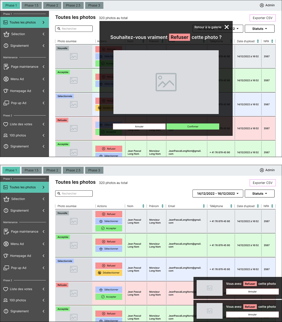
The last two action would get stored
Ease of use VS data gathering
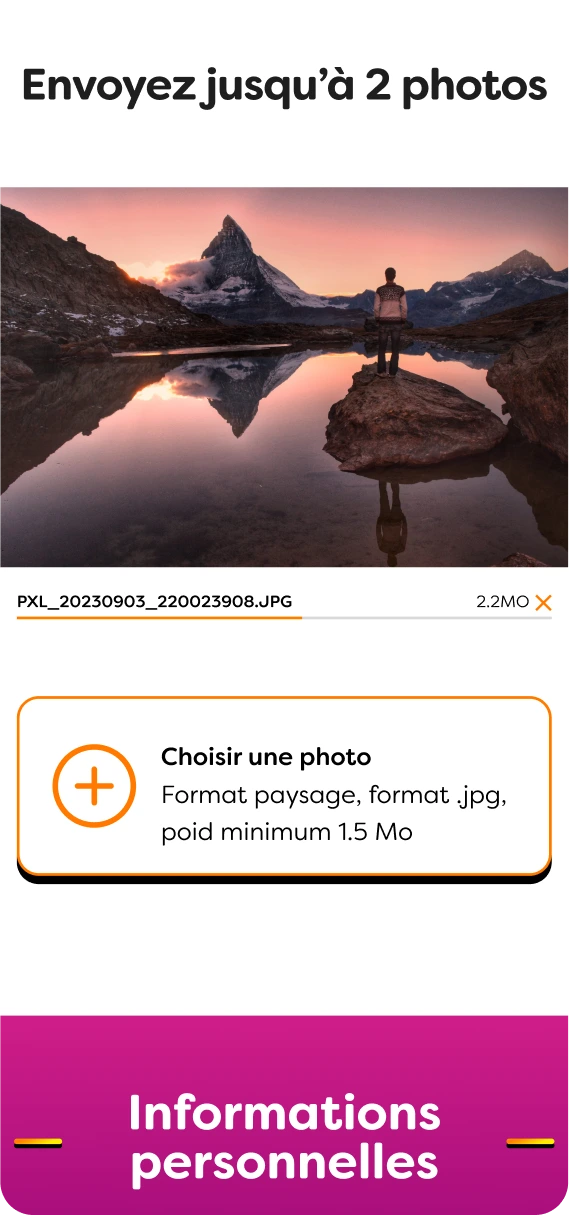
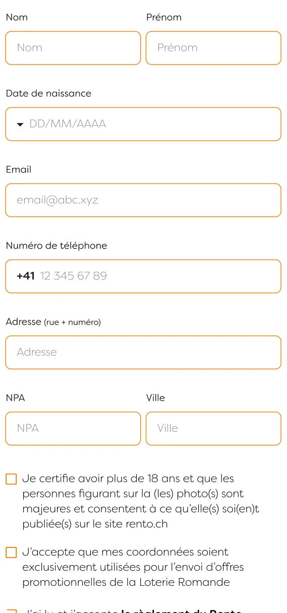
In order to enter the contest, participants were required to select pictures (the fun part) and then complete a form with personal questions (the less enjoyable part)
While I advocated for asking only necessary questions to ease participants' experience, the client viewed it as an opportunity to better understand their consumer base.
Given the strategic goal of pleasing the client, I consulted with both my UX director and technical director. We decided not to push this fight. However I did manage to convince them to remove the gender and title fields, easing the process, if ever so slightly, compared to the previous year.
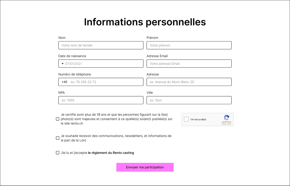
Final form fields
UI dEsIgn
Visual iteration
Given the project's brief timeline, extensive redesigns were not feasible. I presented three distinct visual ideas, varying in levels of fun and deviation from the previous year's design.
While two fell flat, the third resonated instantly, requiring only minimal changes. This quick alignment with the client's preference marked a major win for the project.


Reducing loading perception through animations
Given the image-heavy nature of the website, I was concerned about loading times, especially for users with slower internet connections. To eleviate the experience I implementing an animation on click for key CTAs.
While the animation is subtle on desktop or with fast internet, it significantly improves responsiveness perception in certain mobile situations.
FInaL ProdUcT


