

Given these restrictions, we started looking for ways to speed up the process without shooting ourselves in the foot for the future. We very quickly decided that we were going to build a custom design system with just the parts we needed.
This allowed:

I am unfortunately not allowed to share the wireframes or final visuals in this case study as I wasn't directly involved in their creation.
Having received wireframes from the UX designer on this project, I started by regrouping similar elements to dress a list of components that will be needed through the development.
Throughout the creation of the design system, we closely collaborated, and discussed where standardization would be beneficial, and where it was necessary to keep some flexibility and how to integrate it.
Being a web game, most pages would only serve one purpose. Except for the team builder, they were all going to follow the pattern of [Navigation] - [Banner] - [Content] - [Invite a friend] - [Footer]
In the spirit of categorizing, the UX Designer suggested using TABS to group related functions on pages. So I included an option on the [Content] section to have 0 to 9 TABS without changing the page structure.

The marketplace was a central part of the game experience. In order to be able to buy, sell, exchange cards, and participate in auction, the user had to be able to easily find the athlete they were interested in.
Knowing that the filters and gallery would be used, either together, or individually, in a great number of pages and section. Both were built as stand-alone components that got integrated into a [Filter] + [Gallery] template.
Some functionalities required a grid, while some other a list. I created the [Gallery] component to be able to easily switch between these two modes with a simple line of CSS. As opposed to the original intention from the developers to create two separate components. Thus simplifying their work, and also allowing more flexibility for the user, allowing them to switch between list and grid when appropriate.

One of the particularity of the filters was that some labels needed a companion icon to make them easier to identify. So I integrated a flexible image option in the label. We also had some less standard components like bar chart showing value distribution.

Alternatives: Buy, Sell, Bid, Showcase interest. As single cards or bundles
The option to Sell your card happened from a different gallery. For the sake of consistency and future proofing, the same layout was also used for these.
The layout variation between the [Gallery] items had to be minimal since the UX team wanted to give the user the ability to search for a card across the ones available right now (Buy), the new ones (Bid), and the upcoming (Showcase interest), and bundles. In order for this to happen, they needed to be able to all be displayed side by side in a grid without any of them looking out of place.

Alternatives: Direct buy, Sell, Make an offer, Propose a price, Propose a price range
To simplify the flows, the UX team decided to link the cards details and the transaction.
The cards could be access from the [Collection] (Sell your card), the [Gallery] (Buy, Bid, Etc), or the team builder (add to team). To accommodate this, we needed a flexible layout that could host a variety of modules:

Alternatives: List, Team builder, Team recap
Some situations required the user to be able to view a greater number of cards at once. Thus, the condensed view was born. Used in lists, the team builder, and match results, it used a different portrait picture. It aso required great flexibility:


Some exceptions needed to be made to accommodate unique use cases


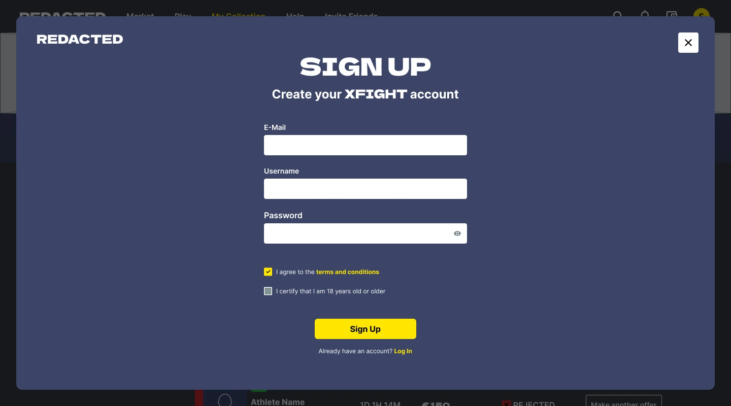
On each page, a lot of the action involving the cards (viewing details, auctions, selling, buying, making an offer) would be done using a system of pop-up.
Like for the page template, a unique pop-up template was created to standardize them. With a flexible content area that would depend on the action taken.


There are a lot of ways a transaction can happen. I created a special transaction variation component that could be inserted inside pop-ups. Giving us the flexibility through it's variants, to display cards, currency, and exchanges


Since the transaction involved the usage of real money stored in the site wallet, undismissible confirmation pop-up were needed. They are a variation of the general pop-up, but without the option to close them, and without the flexible content field. Instead having a single text field, and two CTA, cancel or accept.

Like many other main actions, they happened through pop-ups and combine a lot of the previously shown elements

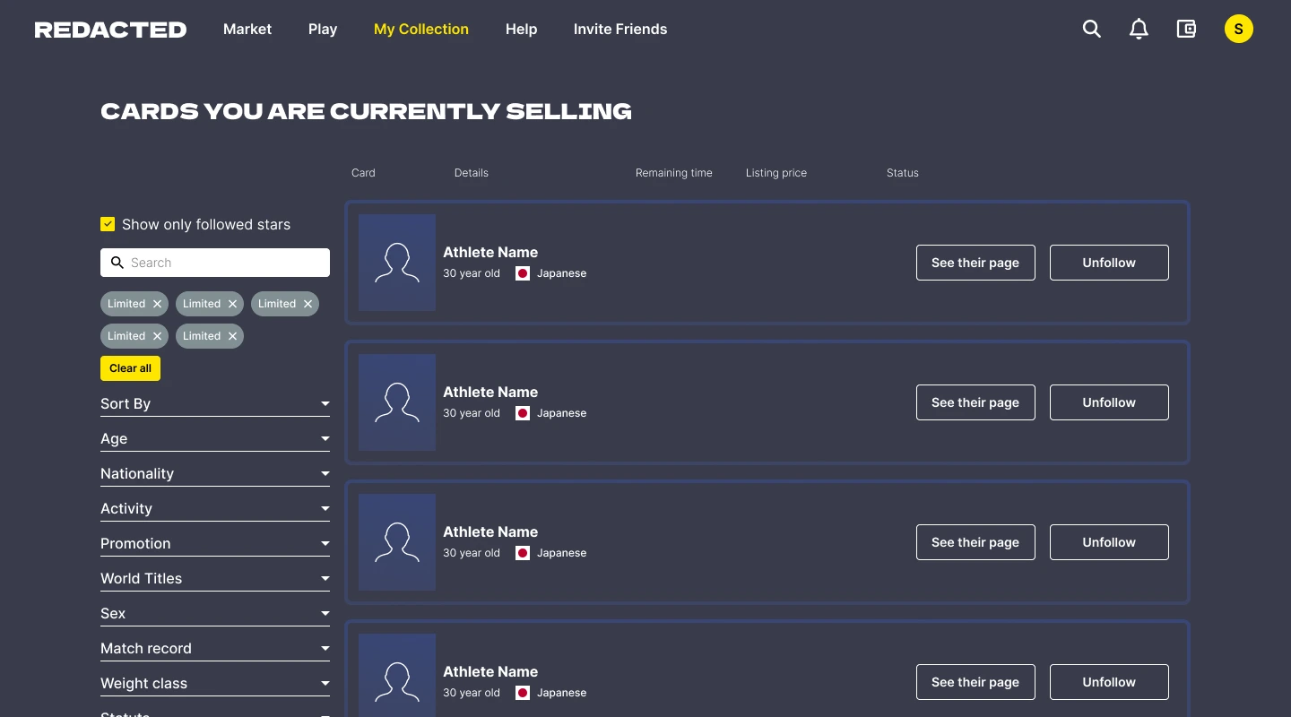
This type of list was used to showcase your card listing, the offers sent, the offers received.
Depending on the type they showcase they used different type of information, status, and CTA


Special lists were created to showcase the available tournaments. As well as their potential prize pool and the post tournament player ranking.


With expertise in user experience design, web design, and design systems, I bring a unique blend of marketing insight and technical collaboration to every project.
My technical experience, allows me to closely work with developers to ensure seamless planning, execution, and integration of design requirements

